The Importance of Benchmark Reporting for Your Patient Engagement Solution
Written by: Jessica Long, Solutions Director and Cheryl Reifsnyder, PhD
Improving patient engagement is an essential aspect of managing a successful medical practice. Better patient engagement can have numerous benefits, including:
- Better health outcomes for your patients
- Improve operational efficiency
- Lowering the overall cost of patient care
- Increasing patient satisfaction, loyalty, and retention
- Positively impacting profitability
In past years, efforts to improve patient engagement focused primarily on patient-provider interactions; however, many modern practices have broadened their efforts, using technology to help improve patient engagement. A 2023 poll from the Medical Group Management Association found that technology for patient communication is the second-highest priority for medical group leaders, while a survey of the College of Healthcare Information Management Executives revealed that 77% of respondents were investing in tools such as mobile apps and enhanced portals to improve patient engagement.
In our last post, we reviewed some tips for identifying the best solution to help you improve your patients’ experience and meet your business goals. This week, we will delve into what happens next, after you’ve selected a vendor and implemented new patient engagement technology: How to assess the effectiveness of your new software, how to use that software to identify potential areas for operational improvements, and the importance of analytics.1
What next?
You are up and running with a new patient engagement solution and it’s time to track your results. Tracking allows you to evaluate the solution’s performance and make adjustments to ensure you achieve the desired results. An important first step is to identify baseline numbers for no-shows, copay collections, confirmation rates, and other items to be measured. This will enable you to compare those starting points to where you are at 3 months, 6 months, a year, and so on. The use of analytics to evaluate the impact of a new patient engagement solution makes it possible to analyze trends and peaks and valleys and how they correlate with different times of the year, locations, and providers at your practice.2
Comparing your results with those obtained by other similar-sized practices can also be helpful. For this reason, Veradigm encourages client-to-client idea and data-sharing. Speaking with other patient engagement users provides the opportunity to learn new workflow strategies and suggestions to try.
Practices using Veradigm FollowMyHealth Mobile Patient Experience can track their specific campaigns through the Power Business Intelligence (BI) dashboard. Practices may choose to use some or all the tools available the FollowMyHealth suite, no matter your specific usage, you can access reporting tools to help understand and maximize the software’s overall impact using the Mobile Patient Experience dashboard (Figure 1).
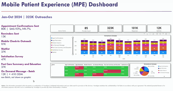
Figure 1 The Mobile Patient Experience Dashboard provides a quick snapshot of overall usage and total outreaches for the selected time period. (The above data is aggregated from several practices.)
The main Mobile Patient Experience reporting page provides a quick snapshot of the overall usage and total outreaches during the selected time period, with different colors for each campaign. This view might reveal peaks and valleys in different months. Since these are mostly appointment-based outreaches, they usually fall in line with the practice’s overall trends and schedule. This is the first place to spot differences and may prompt you to take a closer look at the specific campaigns or even outside factors in your practice.
More detailed information
As you analyze the results of your Mobile Patient Experience campaigns, evaluating those results in light of the original problem or concern you wanted to solve using the software can be helpful. For example, efficiency is a central need for many of Veradigm’s clients. Many practices have long lines at their check-in counters but are unable to hire additional front desk staff. Mobile Check-in can be a significant factor in improving efficiency.
It’s possible to drill farther down into each of your live campaigns to obtain more detailed information. For example, if you have deployed Mobile Check-In, that dashboard (Figure 2) can show you how your practice is benefiting from this effort. The Mobile Check-in provides general information, such as total outreaches and completed check-ins. On the side, graphs show mobile check-in usage month to month, user demographics, and other details. Filters on this dashboard enable you to view data associated with a specific facility, provider, or month.3
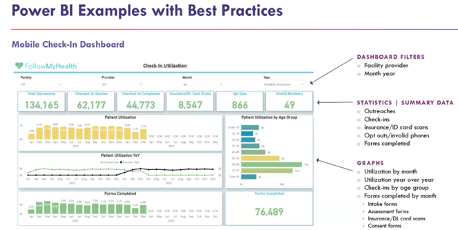
Figure 2 The Mobile Check-In Dashboard provides more detailed data related to the use of the mobile check-in feature and how it might benefit your practice.
Every form completed, every scanned ID, and every demographic update completed via mobile check-in translates into saved time for practice staff. This information can help to guide future directions for your practice or help you see trends and identify changes that might help to improve operations. The details could even serve as an incentive for a provider who might be slow to adopt use of the mobile check-in feature.
Executive Summary format
At Veradigm, we can also provide the information in an “executive summary” format. For instance, the Appointment Confirmations and Reminders campaign sends confirmation text messages to patients prior to their appointments, prompting them to confirm or cancel. The dashboard for this campaign shows the number of appointments that were outreached, the number and percentage of responses received, the number of confirmed appointments, and the number of canceled appointments. This dashboard also illustrates the impact of what happens when patients confirm their appointments.4
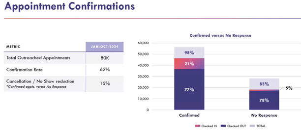
Figure 3 Executive Summary view of Appointment Confirmations for aggregated clients. (Note that all clients in this aggregated sample use mobile check-in.)
The Executive Summary format (Figure 3) provides a higher-level view that pulls out the most critical impacts or opportunities for the business—essentially taking the Power BI information and putting it into a more digestible format with tangible impacts. In the example here, the Executive Summary shows that the aggregated clients sent approximately 80,000 confirmation outreaches and 62% of patients confirmed their appointments. It also includes a graph illustrating the different show rates for patients who confirmed their appointments versus those who didn’t. Using this data, we can see that this set of practices experiences a 15% decrease in no-show rates for confirmed appointments. Even a 10% drop can result in up to $36,000 in retained revenue, which is a major impact for healthcare practices.5
Veradigm FollowMyHealth Mobile Patient Experience
The Veradigm FollowMyHealth Mobile Patient Experience includes multiple tools in addition to those shown above, including:
- Mobile Check-In with Copay and Balance Collection– enables patients to update demographic and insurance information, complete intake forms, and pay copay or balance before their visit, significantly reducing staff and patient time required for appointment arrivals
- Appointment Confirmation and Reminder– send confirmation and reminder text messages on a practice-determined schedule to help keep your schedules filled consistently
- Online Scheduling– patients can access self-scheduling 24/7 based on practice-configured guidelines
- Waitlist – allows patients to sign up for notification if an earlier appointment opens up matching their configured settings for appointment type, provider, location, etc.
- On Demand Messaging– client-customized messages that are useful for communicating any information you want your patients to be aware of, such as introducing them to a newly available feature; or to help patients know what you need from them next, such as scheduling an appointment or calling the office
- Post-Care Summary and Education– texts a link to the patient with post-care summary information after their appointment
- Patient Satisfaction Survey– provides information about what’s going on in your practice from the patient’s perspective, helping you to identify areas you might want to improve
Clients using multiple campaigns often find that the different campaigns benefit each other. For example, appointment reminders tend to increase waitlist use; waitlist use tends to improve patient satisfaction. The more campaigns a practice uses, the better they work together.6
Financial impacts
Each part of your patient engagement campaign will have its own financial impact. Every phone call you don’t have to make, every piece of paper you don’t have to print, every piece of information that comes in via mobile check-in saves time for your staff—and time equals money. In addition, using analytics to evaluate your patient engagement results can reveal trends or areas where practice operations might be improved or adjusted to support your business goals. Analysis can also help you learn which campaign is having the most significant impact—on your operations, your staff, and more.
Mobile Patient Experience from Veradigm FollowMyHealth is designed to help healthcare practices improve patient engagement and—in the process—increase staff efficiency, reduce practice expenses, and improve patient outcomes. Contact us today to learn more about Veradigm’s MPE and the impact it could have on your practice operations.
How Much Are No Shows Costing Your Practice?
How Much $$$ Is Not Engaging Patients via Their Mobile Device Costing Your Practice?
References:
- Webinar: Patient Engagement Benchmark Reporting: How One Practice is Driving Change with Power BI. Accessed November 22, 2024. https://veradigm-1.wistia.com/medias/0tqskuzcma.
- Webinar: Patient Engagement Benchmark Reporting: How One Practice is Driving Change with Power BI. Accessed November 22, 2024. https://veradigm-1.wistia.com/medias/0tqskuzcma.
- Webinar: Patient Engagement Benchmark Reporting: How One Practice is Driving Change with Power BI. Accessed November 22, 2024. https://veradigm-1.wistia.com/medias/0tqskuzcma.
- Webinar: Patient Engagement Benchmark Reporting: How One Practice is Driving Change with Power BI. Accessed November 22, 2024. https://veradigm-1.wistia.com/medias/0tqskuzcma.
- Internal Data: Based on competitive data, 500 appointments per week, $100 revenue per appointment, 14% no-show rate.
- Webinar: Patient Engagement Benchmark Reporting: How One Practice is Driving Change with Power BI. Accessed November 22, 2024. https://veradigm-1.wistia.com/medias/0tqskuzcma.